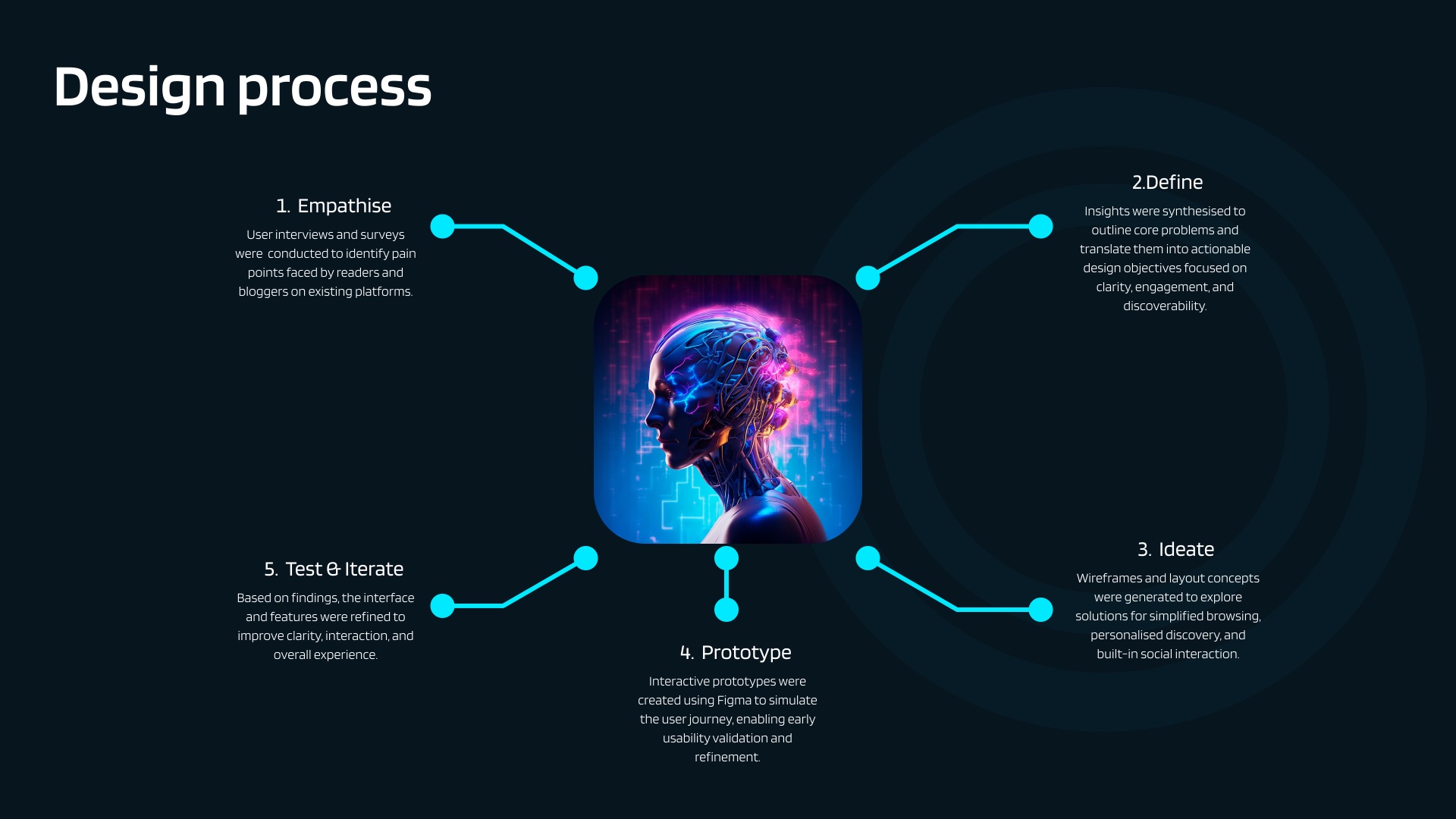
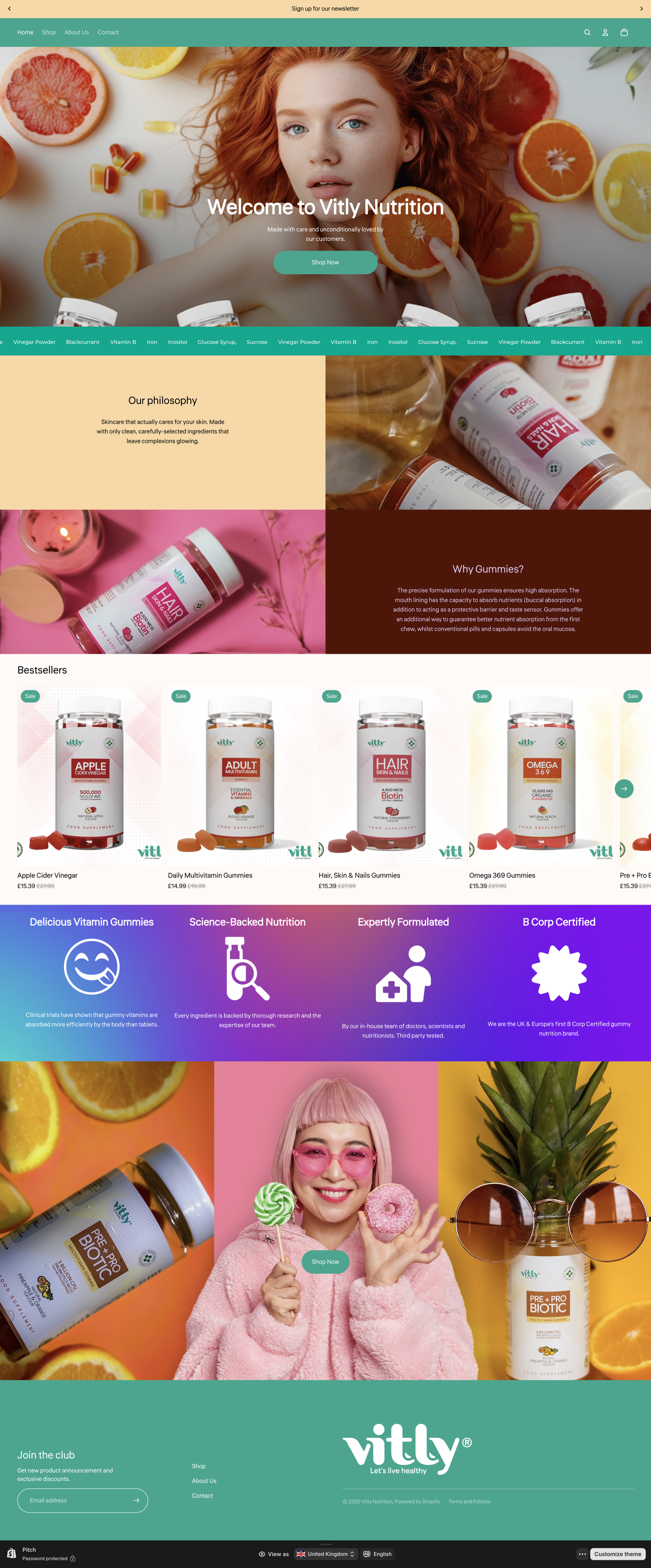
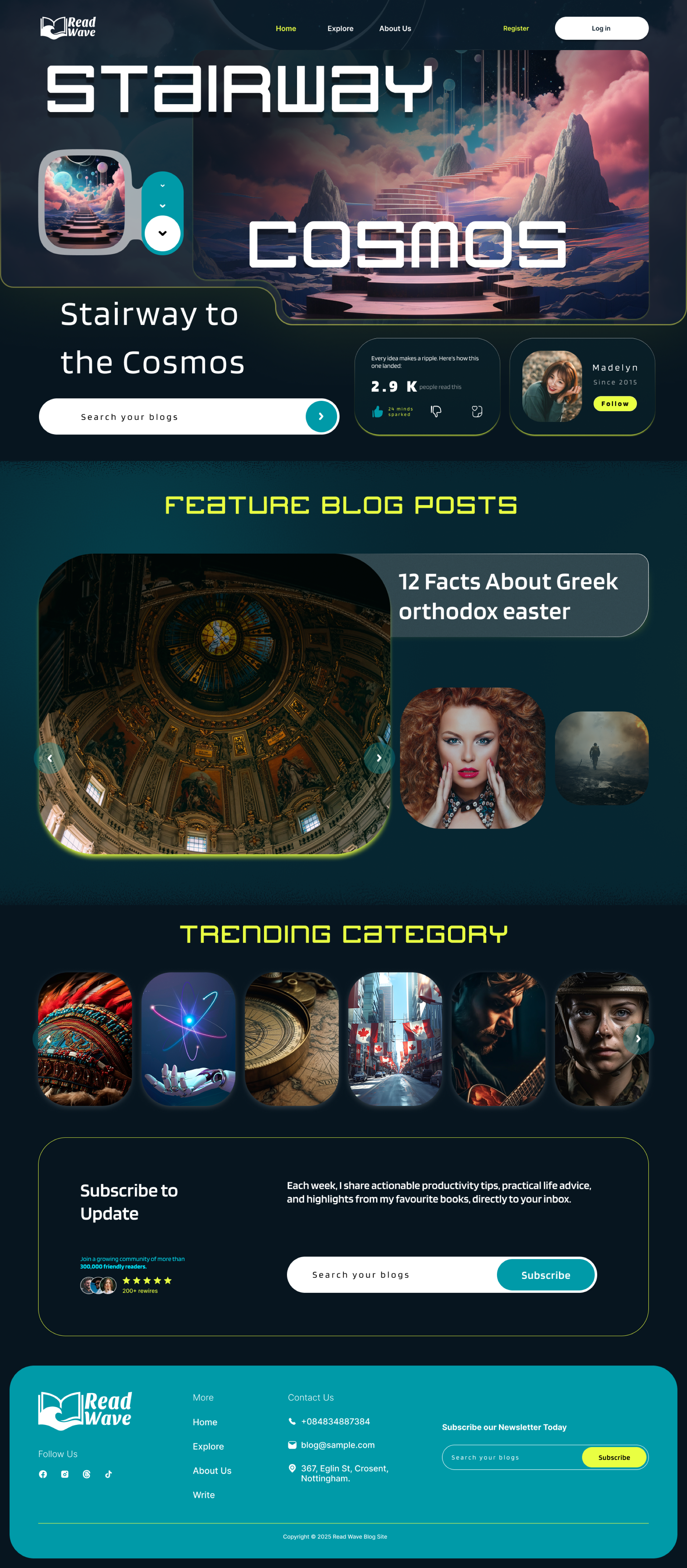
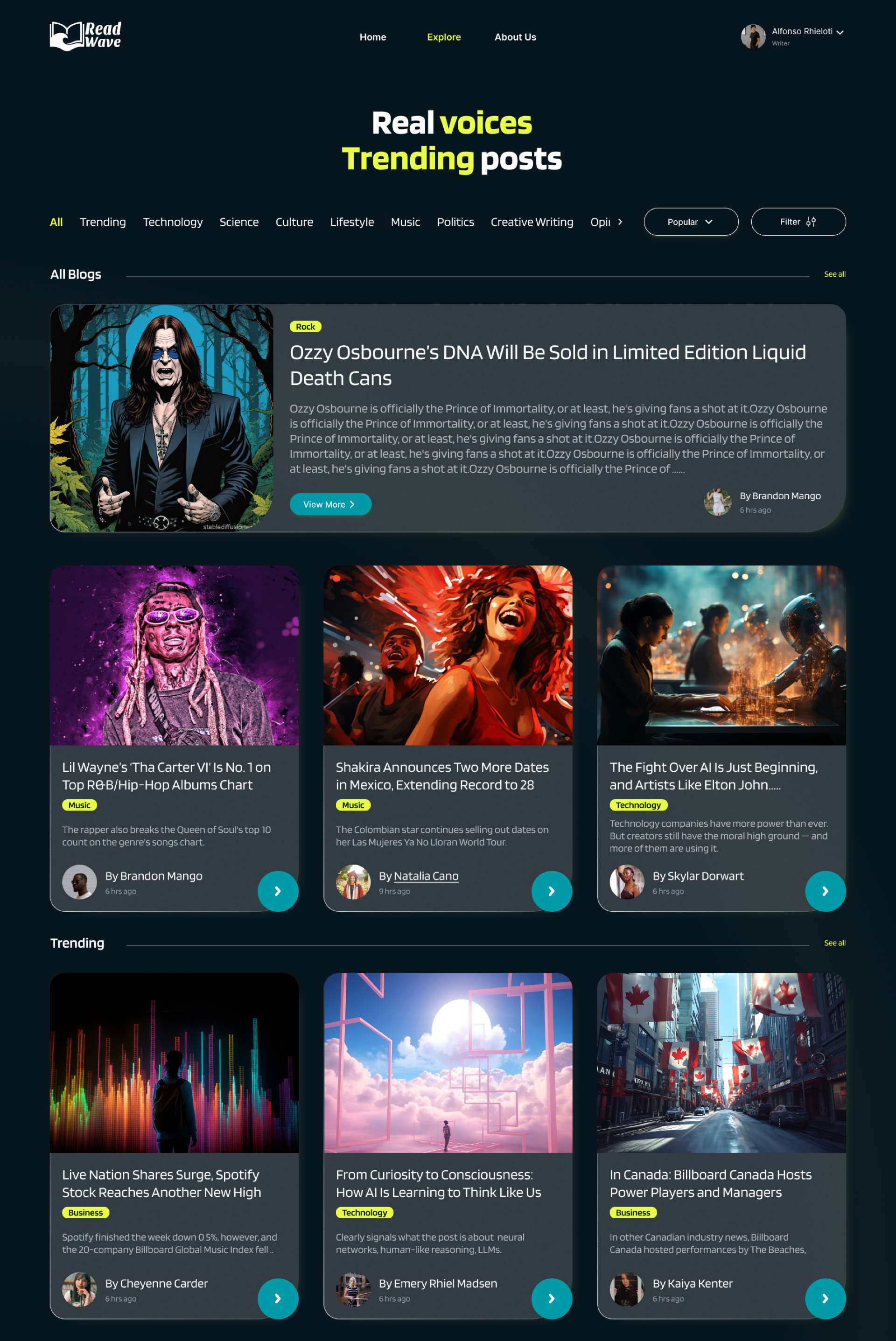
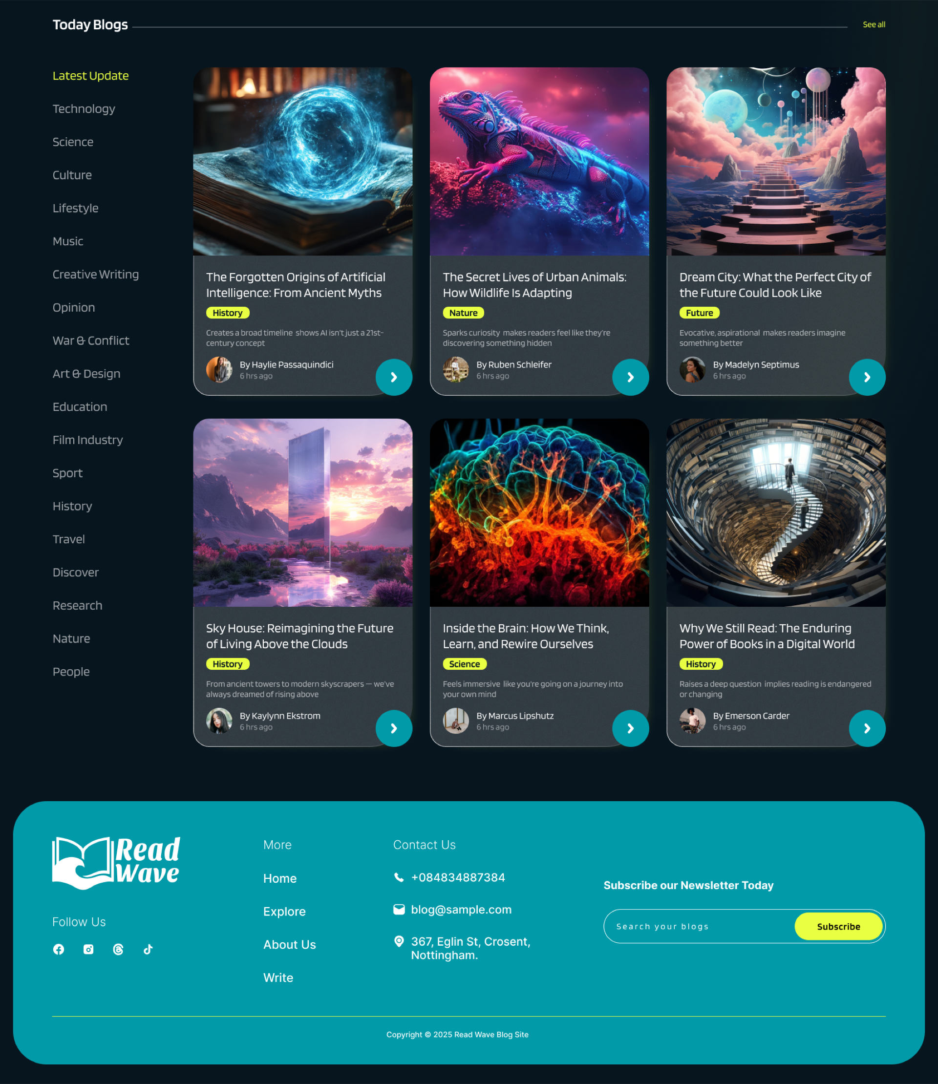
♦ Final UI Screens
The Finished Design
Eight fully designed screens covering the complete user journey — from landing on the homepage to reading an article, exploring categories, logging in, and managing a writer account.
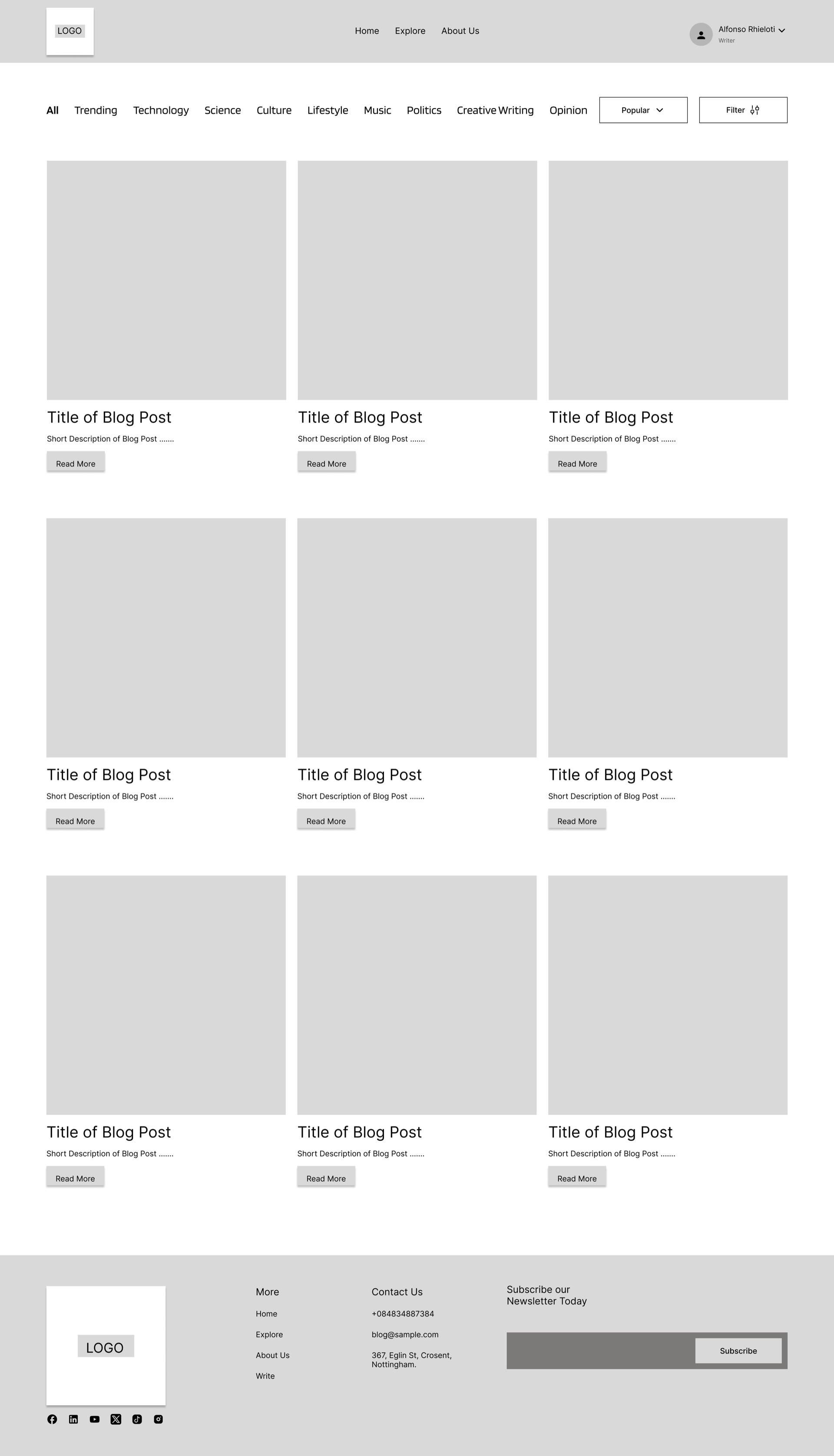
Home
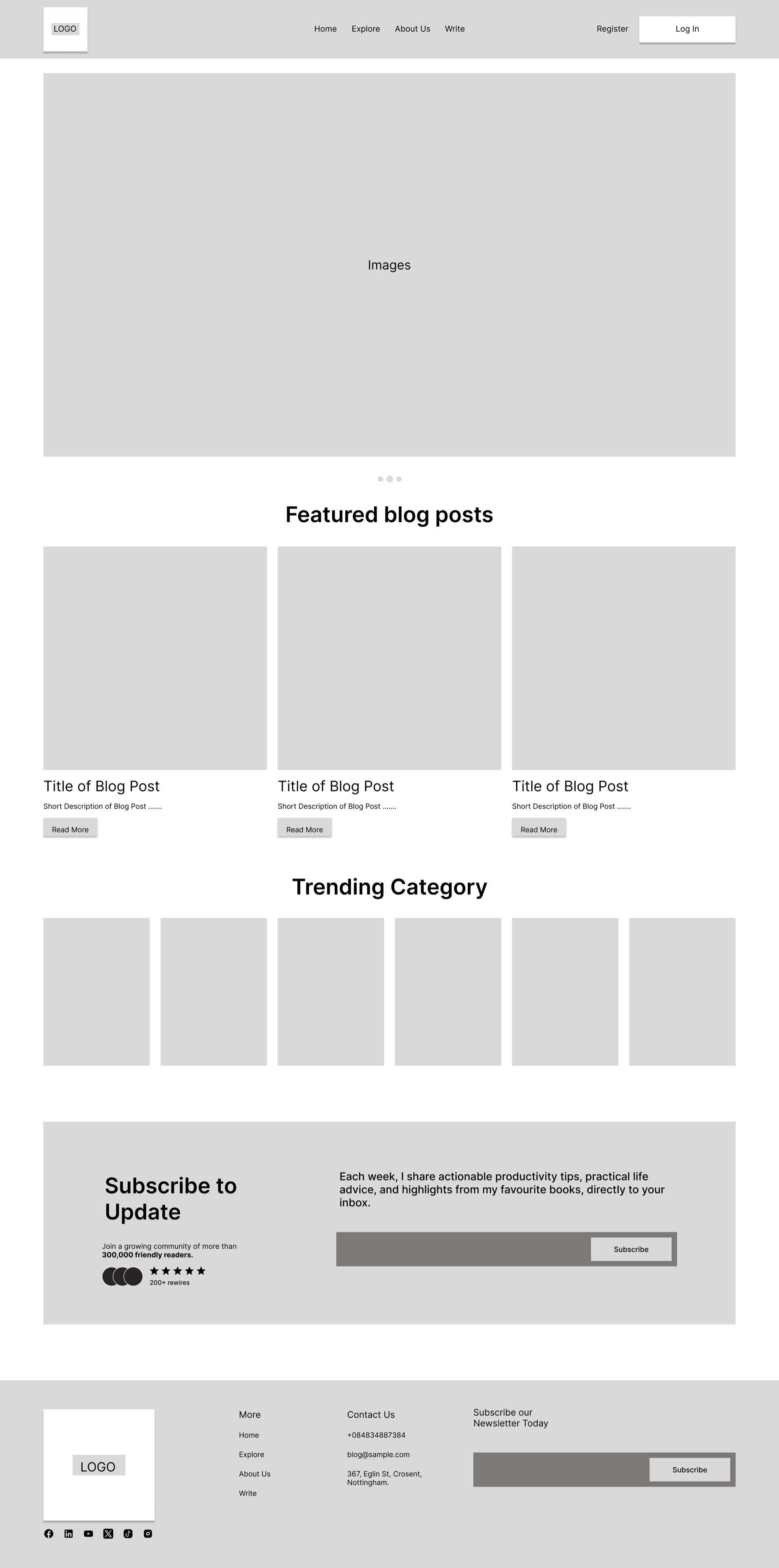
Explore
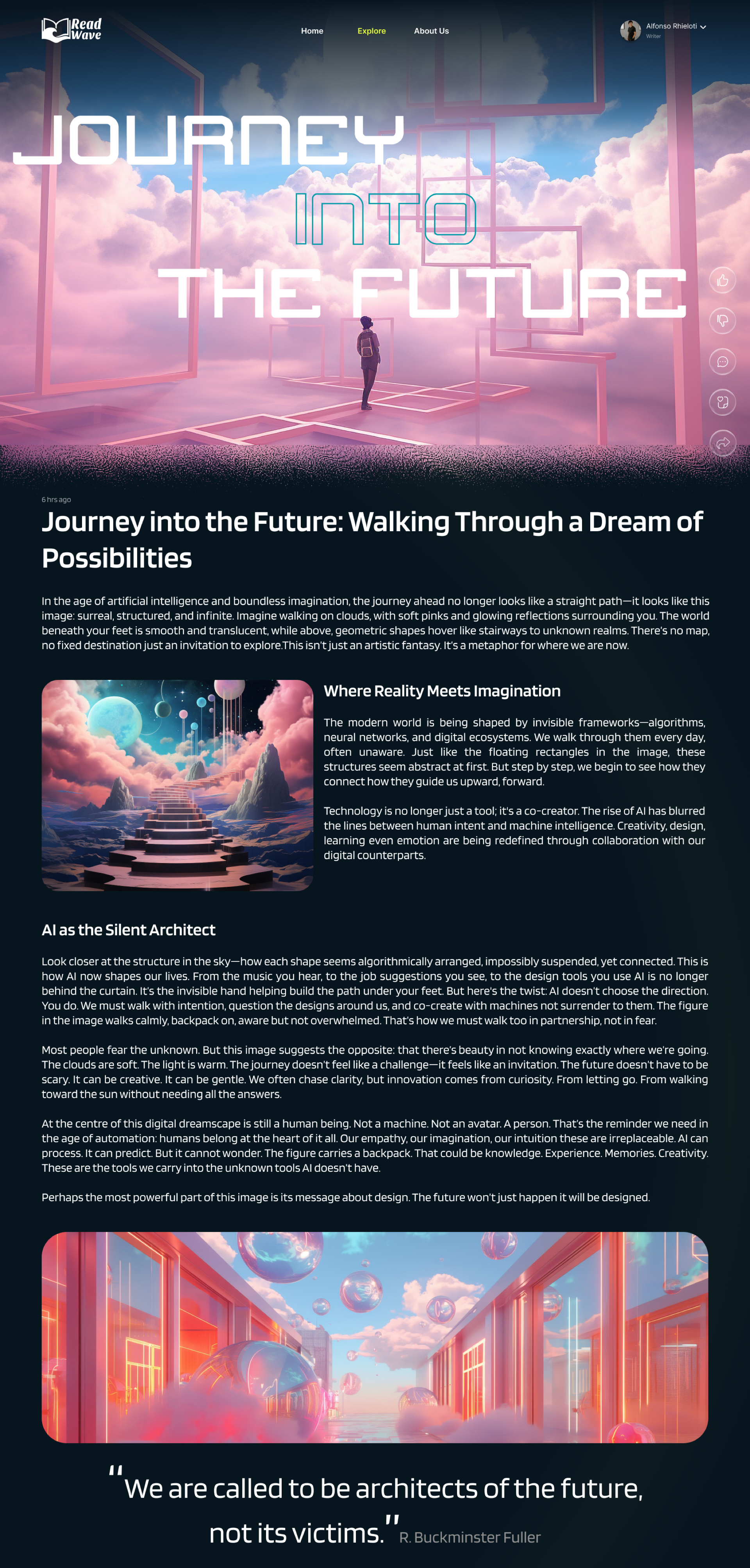
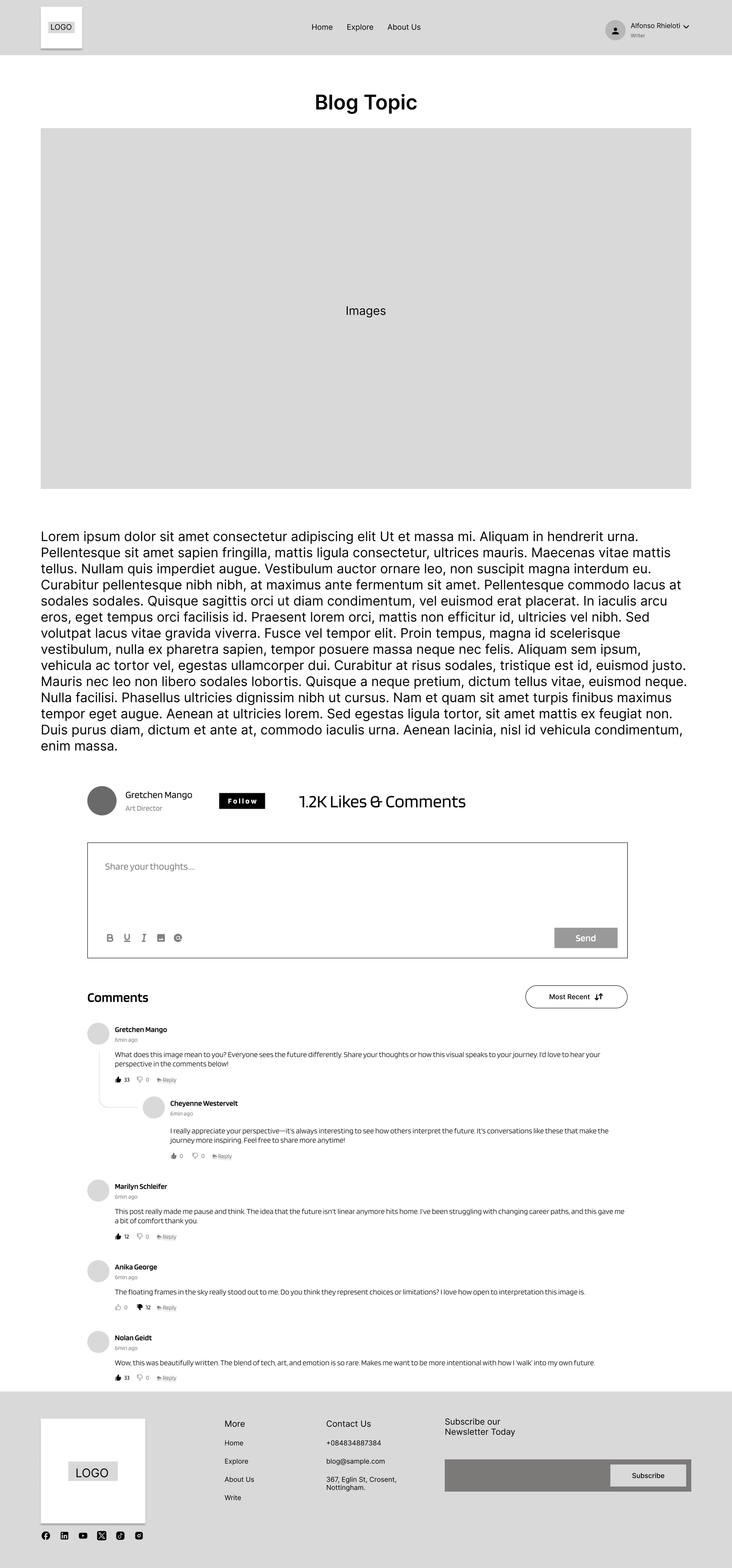
Blog View
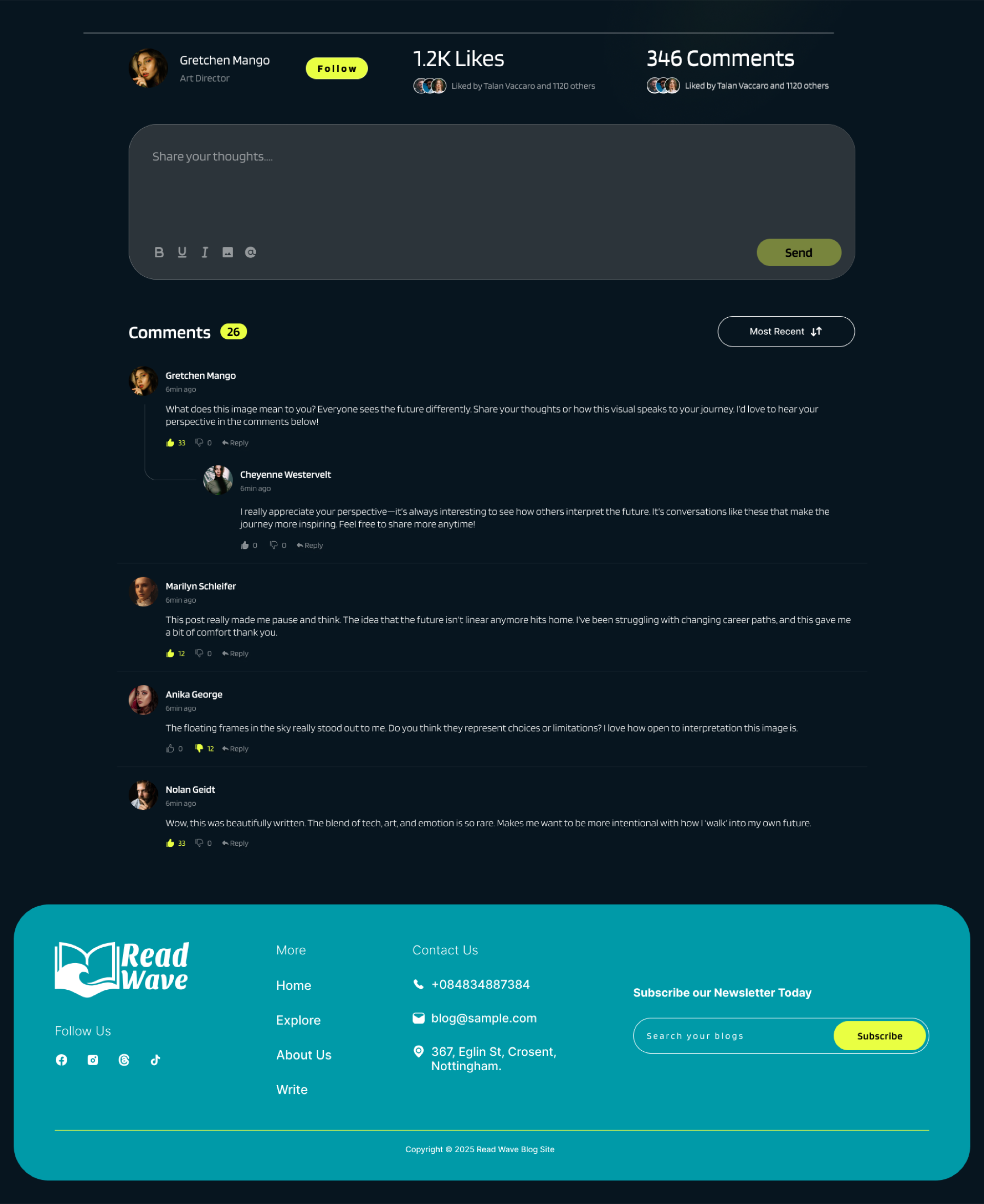
Blog View 2
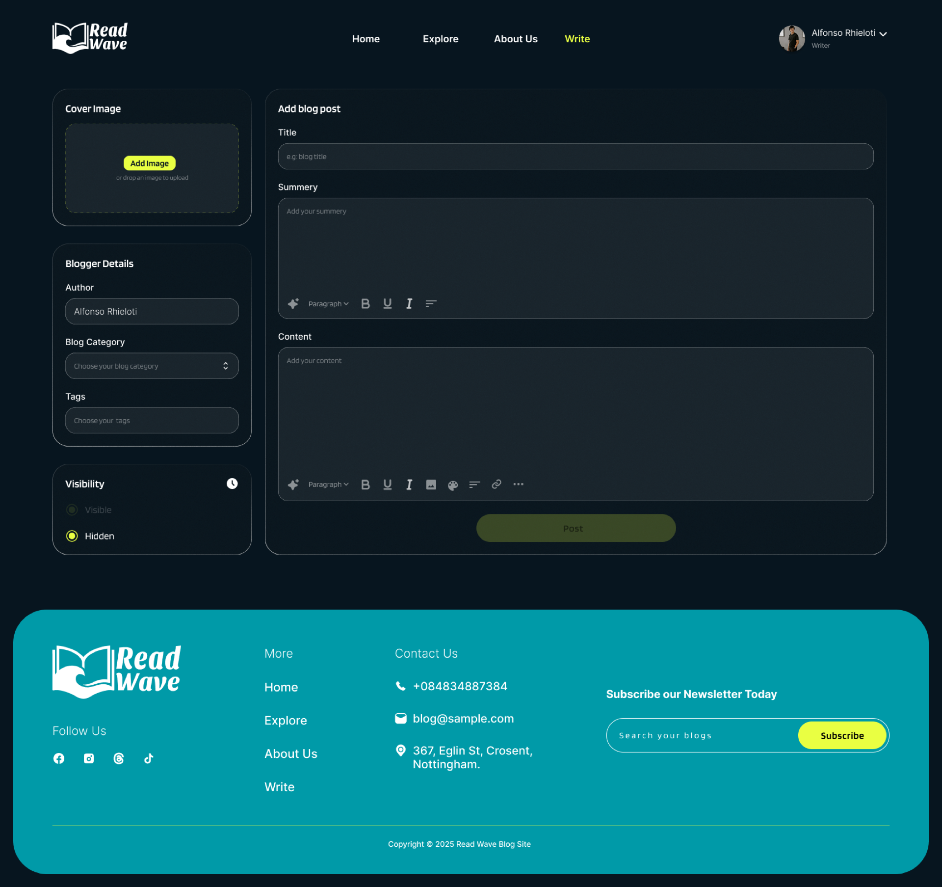
Blog Upload
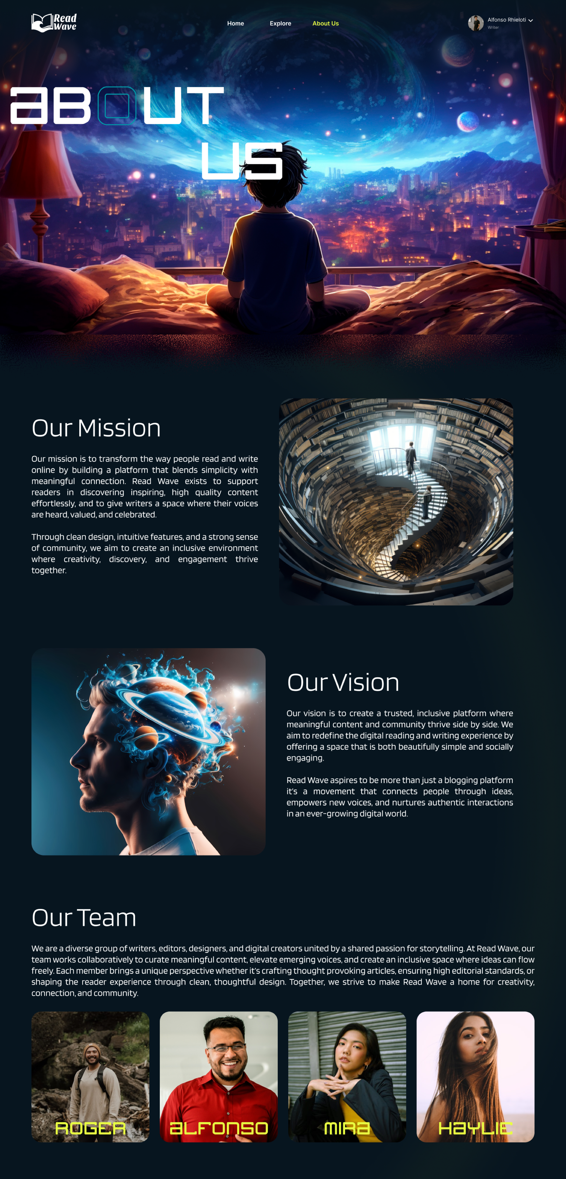
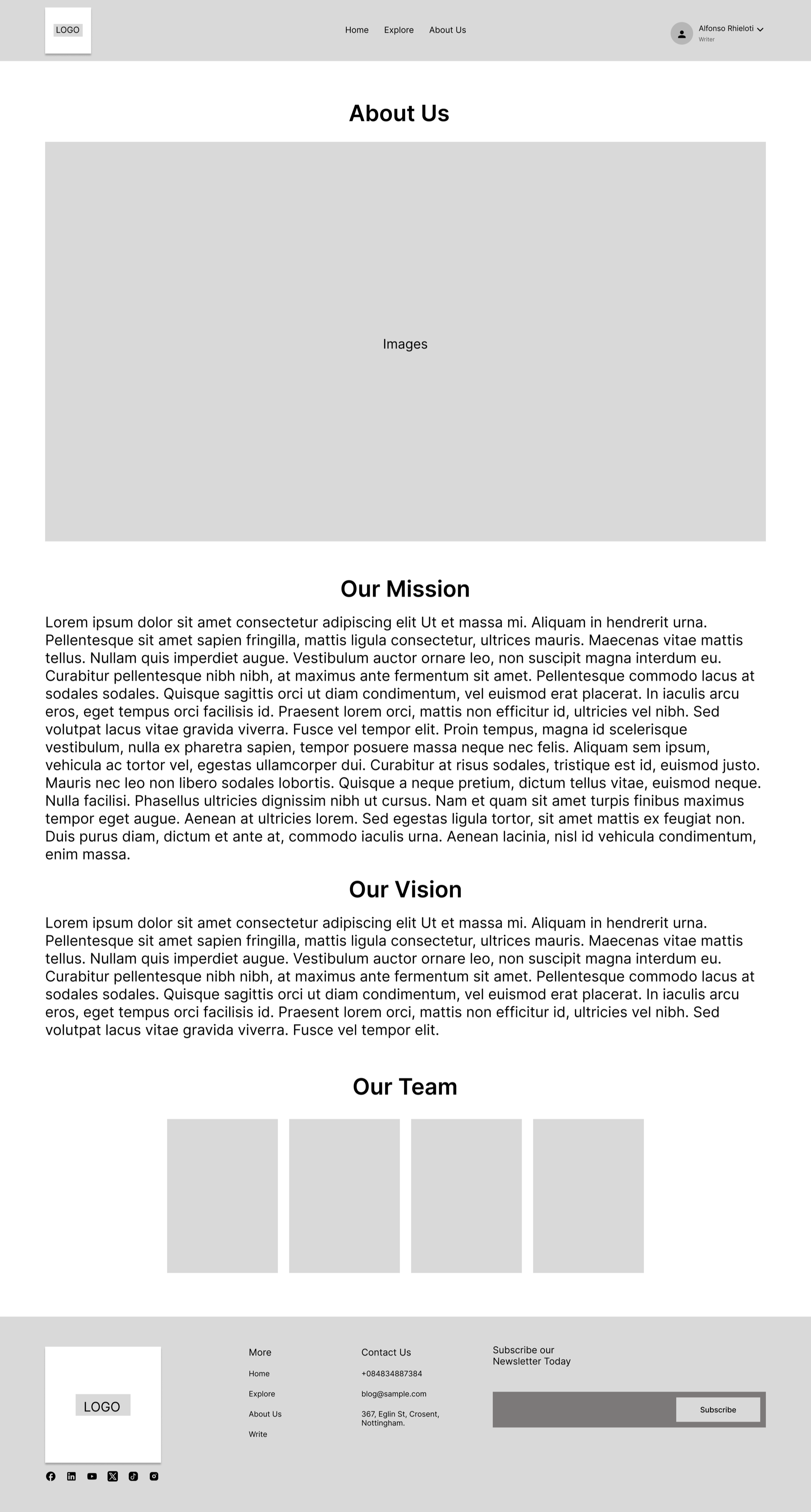
About Us
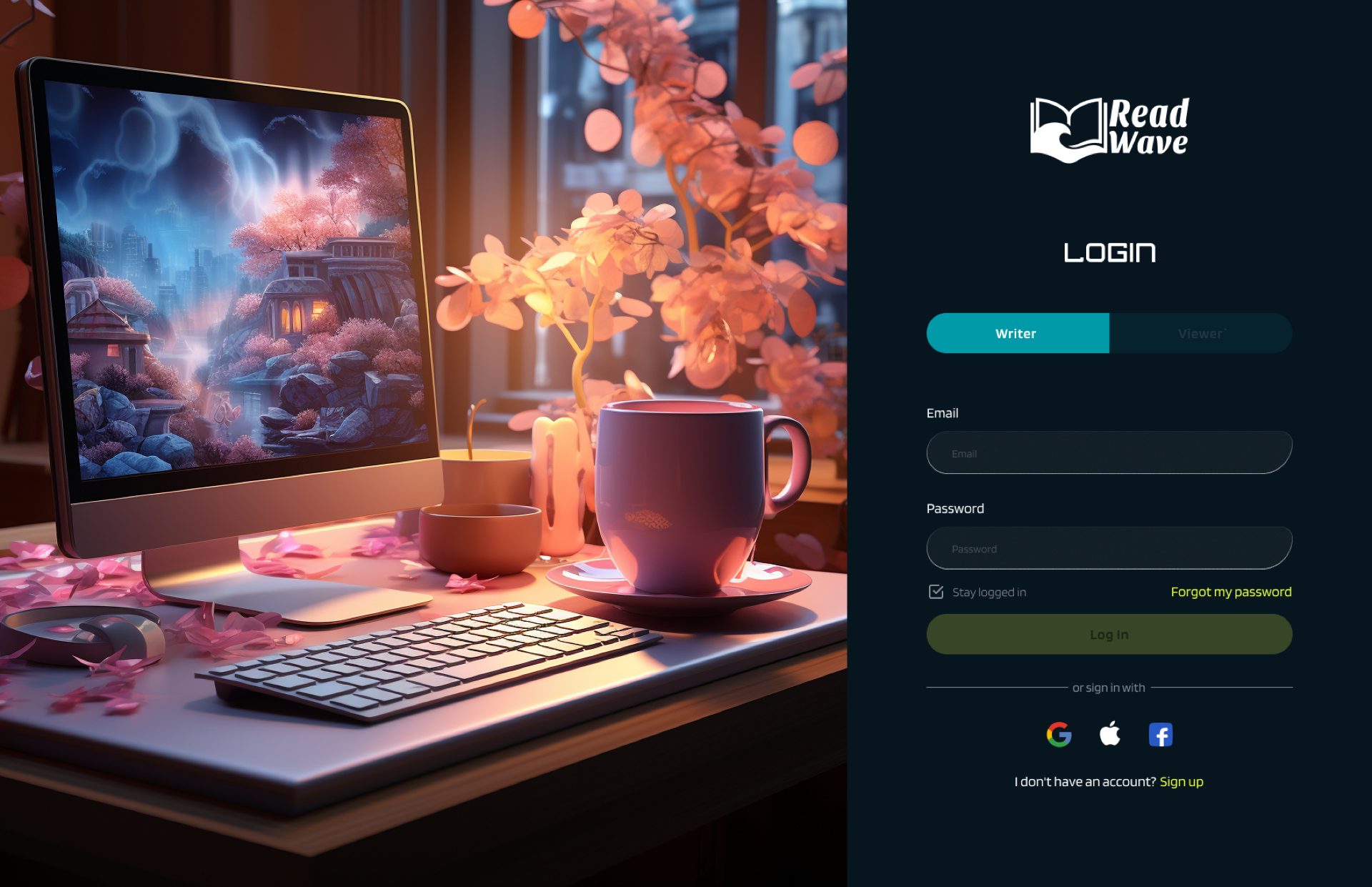
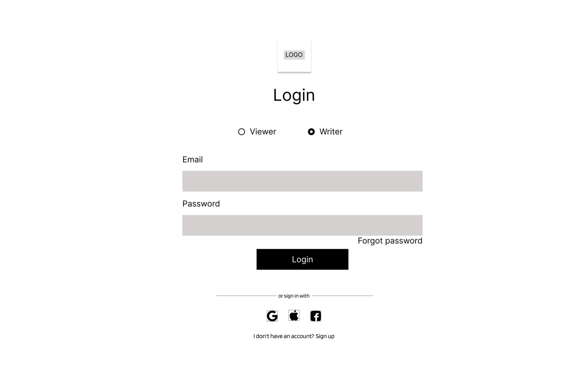
Login
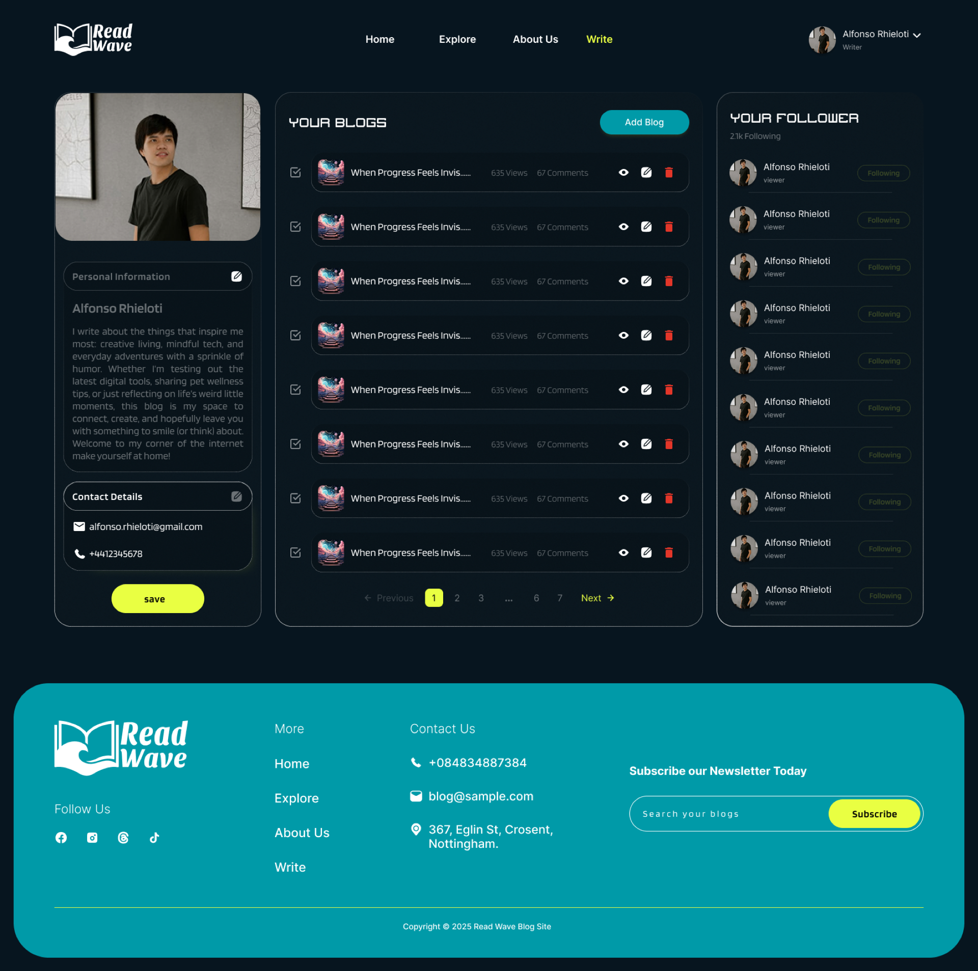
Writer Account
Explore 2